Law 25: A Quick Look at Quebec's Answer to GDPR
Quebec’s Law 25 has arrived to revamp privacy laws in the province’s private and public sectors....
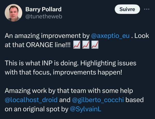
As a 3rd party, Axeptio is taking an active part in improving Responsiveness on the web. Our CMP improves web performance by collaborating with Google Chrome teams, yielding faster load times when cookies are accepted.

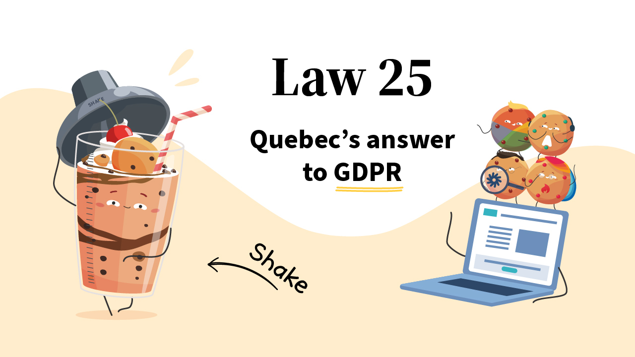
Quebec’s Law 25 has arrived to revamp privacy laws in the province’s private and public sectors....

On the airwaves of FM 103.3 La Radio Allumée (Quebec), Max Trudel engages in conversation with...

The Paris Opera, a world-renowned cultural institution seeks to increase its cookie acceptance rate...
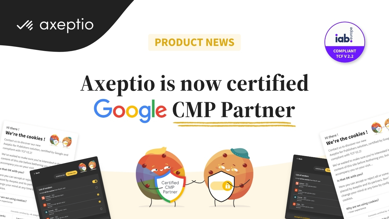
Axeptio is proud to announce that its Consent Management Platform (CMP) has been certified by...
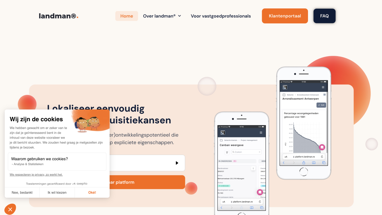
Learn how Axeptio and landman® team up to revolutionize real estate in Belgium. Landman® unveils...


Axeptio announces that less than 5% of Quebec companies are compliant with Law 25. Axeptio predicts...

In early January, Axeptio organized a webinar for Product Managers and Designers to learn about the...

Axeptio is launching Axeptio for Publishers, a CMP compatible with TCF (IAB Europe and Canada). Are...
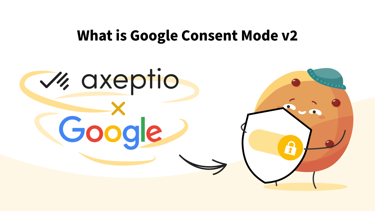
The updates to Google services to comply with the European DMA regulations are reshaping data...

Axeptio is launching a new consent management solution compatible with IAB Europe's TCF v2.2...
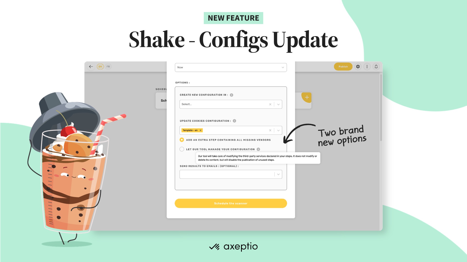
Shake - our brand new cookies scanner with automated configuration updates.
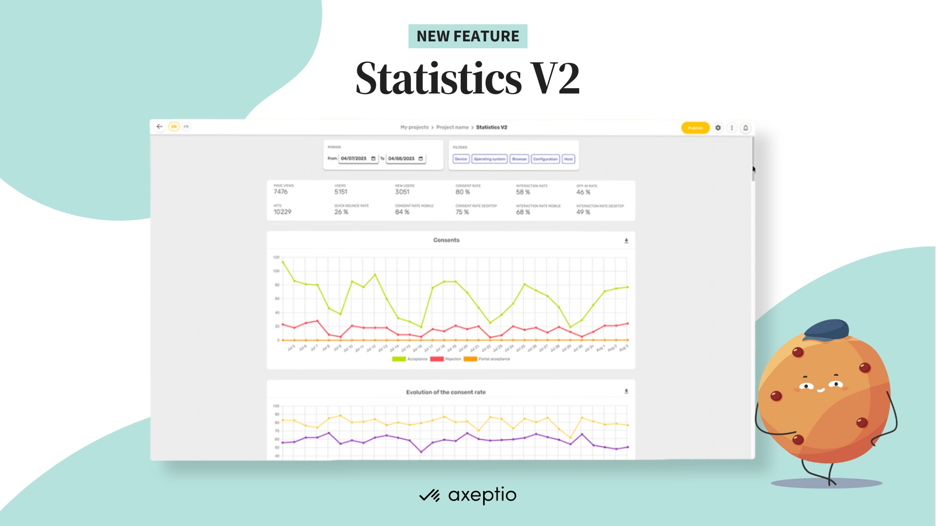
Axeptio is announcing an improvement of consent metrics dataviz.
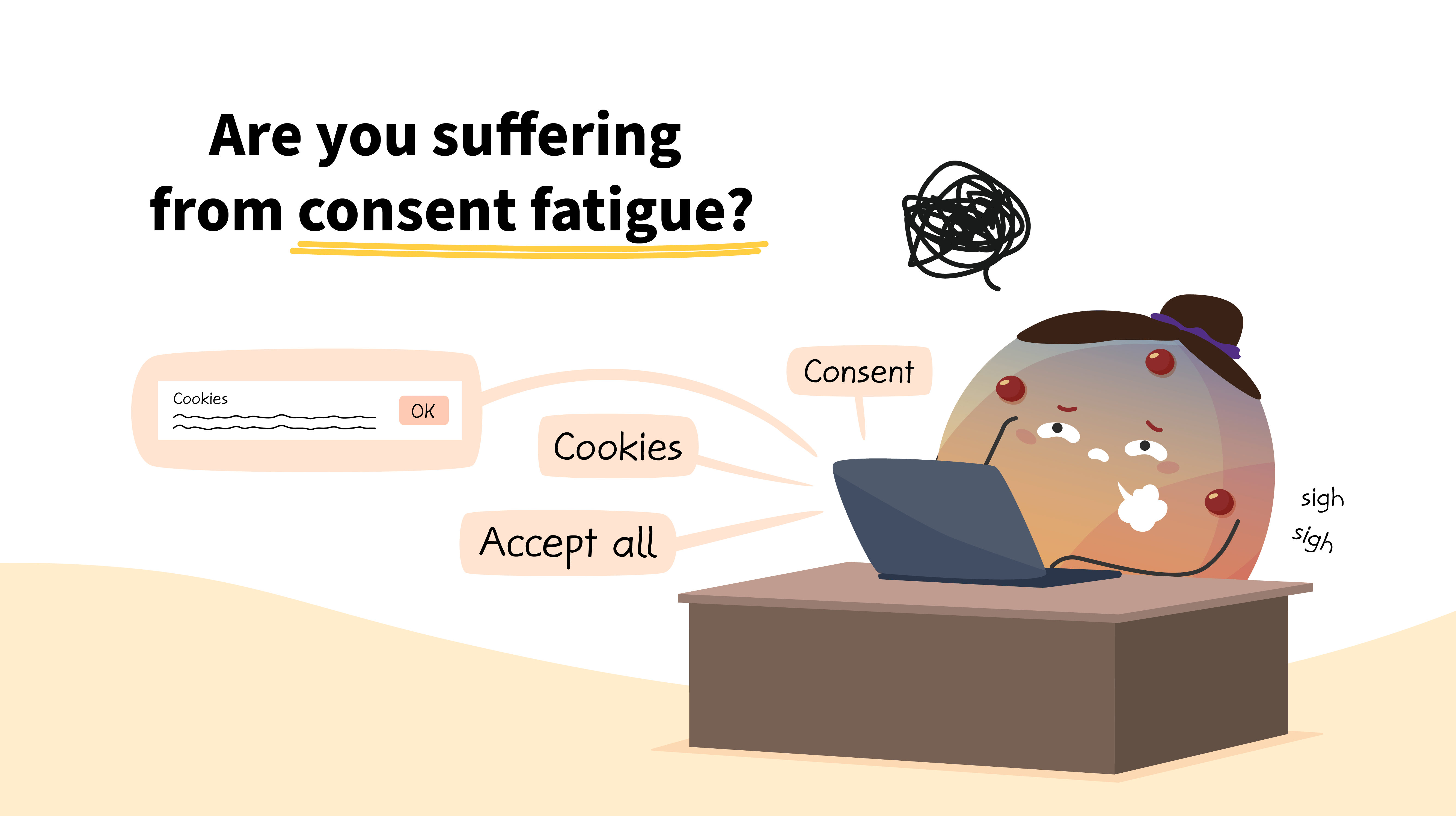
User consent fatigue is concerning because it impacts your performance metrics. To address this,...
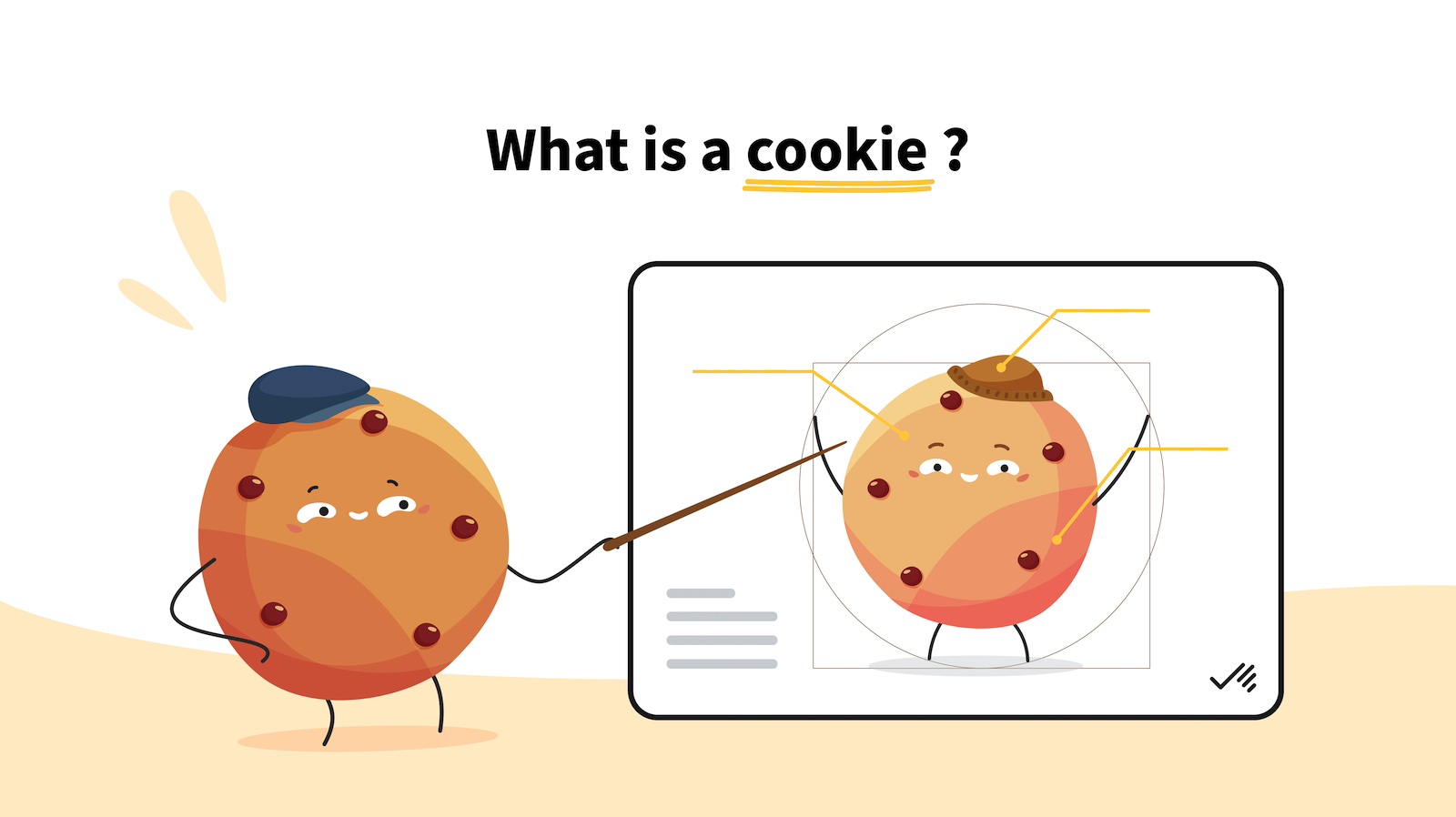
It's always better to know what it's all about before you give your consent, right? Our article...